

The objective was to create a brand new corporate identity for a freshly developed residential housing called Panorama Chlum located close to the National Park Šumava and its unique nature.
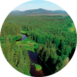
The beautiful surroundings of the residential area were the main inspiration for the brand identity.
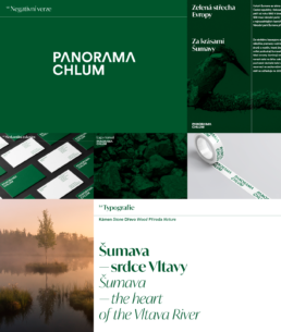
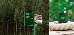
Nature, trees, wood. Green color symbolises the color of nature, healthy landscape, balance and peace. In the logotype, we replaced the letter A with a triangle which reflects both the surrounding forested hills and the original folk alpine architecture used in the residential design.
The main objective was to create an elegant and easily adapted solution which reflects the pure nature of Šumava.
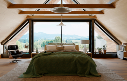
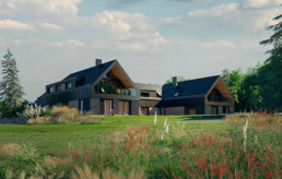
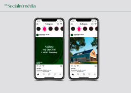
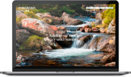
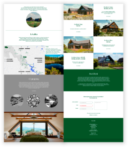
The brand identity must not disturb the harmony of the project. On the contrary – it must go hand in hand with the architecture. The result is a distinctive and memorable identity with a fully functional brand book. The scope of the project includes architectural visualizations, promotional booklet and website of the housing project. All of which is in line with the mission of Panorama Chlum – to provide a natural haven for those exhausted by the city hustle.
Other projects